CoTripper
Start To Finish Community Platform
“Simply because all family types should have ease of access to family travel.”
Design Challenge
In early 2019, Krystin Hargrove looked for a platform that spoke to the preferences a single mom might have around family travel. When she couldn’t find one, she founded and built CoTripper: a community platform that simplifies the way single moms and their children explore the world around them.
Client
CoTripper serves as a travel platform for single mom families, and aims to encourage ideas, exposure to travel experiences, and to be helpful around planning vacations and building communities. They want the platform to facilitate community-driven support for single moms of all types and experiences.
Deliverables
High-fidelity clickable prototype
Case study to document our process
Artifacts documenting research and design decisions
User Need
CoTripper wants to focus on user stories, effectively building community, and redefining public opinion on what it means to be a single mom. To do that, they need to restructure the platform as both a product and a service so that it better reflects the needs and preferences single moms have around travel.
Constraints/Role
Timeline: 15-day design sprint
Team: 3 members
Role: UX Designer, Research Lead


Research Takeaways
Methodology
As a man, I made no assumption when it came to understanding the perspective of a single mother. To ensure that our design decisions are true to the needs of our unique group of users, my team and I attempted to gain clarity on three main concepts:
What is it like to be a single mother?
What are their habits surrounding family (and independent) travel?
What does their engagement with the community, if at all, look like?
To get this information, we went straight to the source of our audience:
We interviewed 11 single mothers, all of whom had one to two children of mixed genders, ranging from -2 months (one of our mothers is expecting!) to 20 years old. We specifically focused on the topics surrounding travel and community from the perspective of a single mother.
We created a business canvas to look into the communities and industries catering to single moms. Most forums and blogs were disaggregated in topic and difficult to navigate, and vacation packages were sold without specific considerations for moms with families.
Research Takeaways
Planning well ahead ensures being well prepared for all occasions.
Traveling can be difficult as the ONLY adult being responsible for everything.
Single mom veterans feel more competent and join communities that appeal to their personal interests.
Both parent and child preferences and priorities should be taken into account for all to enjoy the vacation.
Keeping children occupied is difficult, but watching them explore and learn is worth the effort.
♦️Takeaways Implementation
A forum consisting of community-driven content so users can be informed
Make new connections with other single moms sorted by distance AND by interests.
Groups, sorted by location and interest, to allow users develop their interests and make connections.
Trip booking view that emphasizes activities both for moms and for the family.
Combining all aspects of trip planning within one app so single mothers can focus on the travel experience with their children.
*for more details on my research methodology for this project, please visit the full case study here.
Rapid Prototyping and Usability Tests
♦️Rapid Prototyping
Within the span of one week, we iterated on our prototypes twice, first using paper prototypes to a greyscale Balsamiq prototypes, then to a high fidelity Figma prototype. We made sure to keep each prototype fidelity at its appropriate level to ensure effective use of our time.
♦️Usability Testing
For each of our iterations, we performed five usability tests. We were limited in our test audience due to the specific population our app was for, so we adapted with the following: for our first iteration (paper to Balsamiq), we tested with users of all demographics to ensure that our general onboarding, forum, and navigation flows were reasonable. For our second iteration (Balsamiq to Figma) we tested with all female users to gain a more specific perspective.
Low-Fidelity: Paper Prototype
Once we finished our user flows and wire flows via whiteboard, we transferred them onto paper prototypes for our first round of usability testing.
Round 1: Testing Insights
Users had difficulty understanding our global navigation hierarchy due to different connotations of similar terms
Users utilized the page search bar much more than we originally anticipated, so we kept it there
Differentiated between hashtags and topics; topics have surpassed a certain level of interests (via mentions)
Round 1: Items Changed
Registration: created a splash page to avoid confusion between log in and register
Global Navigation: changed terminology to avoid confusion in word connotation
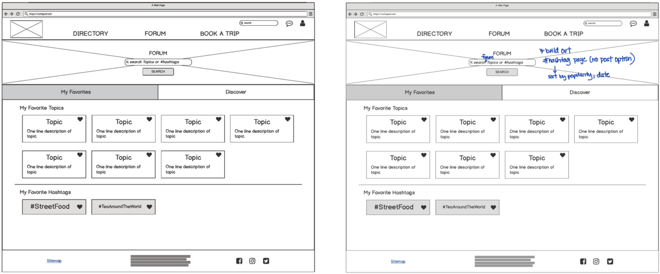
Forums: made a distinction between topics and hashtags that users are following vs. ones they can discover
Profile cards: when asked to connect with another person, users were hesitant to join; added 3 main interests to each person card
Mid-Fidelity: Balsamiq Prototype
Once we marked on our paper prototypes what to change and what to keep, we created a digitally clickable prototype in Balsamiq.
Round 2: Testing Insights
Users still retained confusion around the term “Directory”, had difficulty finding community groups and people
Users couldn’t find the “Join” button in the sample groups page, confused it with “add members”
When asked to find a specific topic, users sought out the search bar immediately
Round 2: Items Changed
Onboarding: combined certain elements of this process because it aligned better with our users’ expectations.
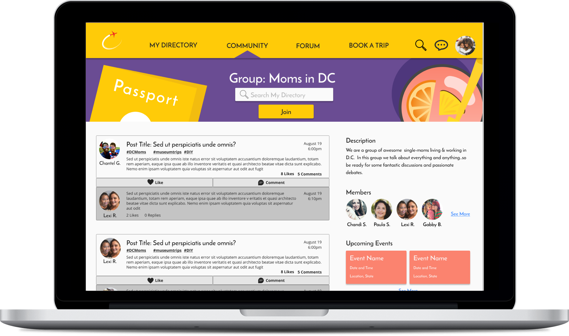
Global Navigation: “Directory” had confusing connotations; added “Community” to differentiate between existing friends/groups and other community people/groups to add
Forums: enhanced the “Join” button to make it bigger and more differentiated (with color), and changed the members button to text for clarity.
Search Bar: we added search hints so users understand what is searchable on specific pages
Profile cards: when asked to connect with another person, users were hesitant to join; added 3 main interests to each person card
Future Iterations
For future iterations, we want to focus on two areas of continued improvement:
Functionality:
Continue building out “Book a Trip” page functionality
Create a file storage and calendar functionality within groups
Incorporate more social media elements/interactivity
Develop a separate mobile application version
Design and Data:
Conduct further user testing on desktop platform to verify design decisions with specific target audience
Privacy and security concerns (especially since children/families are involved)
Build out a data collection framework and visualization tool for analyst
Provide feedback from collected data to the platform community
Expand customizations for greater marginalized groups (i.e. varying income levels, single fathers, etc.)
Things I Learned:
♦️Rapid Prototyping
Kept to adequate fidelity between each prototype iteration in order to focus our efforts on developing features within the scope.
♦️Usability Testing
Observed our usability testers’ mouse movements and actions throughout the usability test to understand common trends and behaviors.
♦️Research/Feedback Implementation
Translated user needs, behaviors, and trends into actionable items within prototypes to maximize efficiency in process flows and user comprehension.


