optiMize
Design Challenge
One of the great things about being in a community is the access to different perspectives, knowledge, and skills. Within an academic and/or business setting, that access becomes invaluable as members seek to improve themselves and their work.
User Need
As the community continues to grow larger, optiMize needs its platforms and systems to grow along with it — currently, community data is organized within Google Sheets. Moving forward, optiMize wants to create a “narrative-driven platform for connecting members”. The core functionality of this product is a community directory. In addition to optiMize’s explicit need for a community directory, we discovered that there was an implicit need for a project management and collaboration tool.
Client
optiMize believes students can change the world. The student-led social incubator provides an environment of learning and mentorship for a community of approximately 2,500 students and members to work and collaborate on self-directed projects that make a positive impact. optiMize awards fellowship funding for projects every summer, and thus far have funded 80 projects over the span of six cohorts. For more information on the client, please read here.
Deliverables
High-fidelity clickable prototype
Design specification for developer handoff
Artifacts documenting research and design decisions
Constraints/Role
Timeline: 11-day design sprint
Team: 2 members
Role: UX/UI Designer, Research Lead



Research Takeaways
Methodology
As the Research Lead, I emphasized evidence as the primary driver of our design decisions. To be as comprehensive as we could given the time constraints, we focused our efforts on the following three aspects of user research:
Project Management Tool Survey - identify common PM tools and potential target interviewees
In-person Interviews - contextualizes survey responses and provides deeper insights into user behaviors
Market Research - understand core functionalities that make PM and mentorship tools successful
User Interviews
We conducted eight in-depth interviews from the list of survey respondents. Their interviews provided deeper insights into user behaviors and preferences, which I used to define which features to prioritize during our design process.
Project Management Survey
We needed to be informed on user behaviors and attitudes in order to accurately design user flows. We aimed to gather respondents who had experience with PM tools, are potential users of PM tools, or have had mentorship or collaboration experience. We received 52 survey respondents.
♦️Market Research
We researched the core functionalities of competing project management tools identified in the survey and interviews, and took into account what features were absolutely necessary for successful project management. We also investigated similar organizations to understand what tools and functionalities they employed for their own systems. Such an example is MENTOR, a national mentoring non-profit that developed proprietary mentoring software that builds mentor-student relationships and tracks their progress.
Key Takeaways
From our research, we came away with a few key takeaways as we began to design the first prototype. First, the final product should be able to increase transparency, ease of use, and collaboration between team members and the community. This emphasized our project’s purpose, and fulfilled optiMize’s user need.
Second, the following features were utilized most often within project management:
tagging or mentioning teammates — increases transparency and accountability
role assignments — gives each person marching orders and keeps them accountable
organizational structure for file storage — mandatory for good performance
interoperability and integrations — provides familiarity and ease of use for new or reluctant users
cohesive tool functionality — keeping all PM tools within one place for convenience
Third, in order for this product to be practical, we needed to keep the system intuitive and easy to use, and ensure that efficient roll-out and training is provided to new users.
*for more details on my research methodology for this project, please visit the full case study here.
Prototypes and Testing
Hypothesis
Using our research takeaways, we developed the following hypothesis to frame our design process:
We believe that additional project management and community building functionalities — surrounding and supporting the core functionality of a community directory — could further foster community and collaboration for optiMize users.
♦️Information Architecture
Based on our hypothesis, our vision for the community application focuses on two distinct parts of optiMize. For the community building aspect, we adhered to the project requirements of a search and discover functionality. We were able to be more creative in designing the project management side, which included common PM functionalities that interconnected with community pages. We struggled to determine which community and PM elements to include on the home page upon logging in, but ultimately decided on personal notifications and action items based on our usability feedback.
Rapid Prototyping and Usability Testing
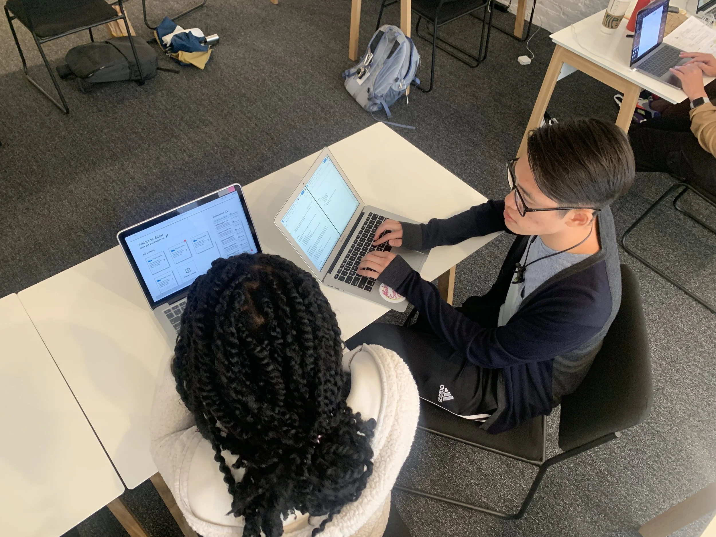
We iterated on our prototypes twice before reaching our final high fidelity clickable prototype, starting from paper prototypes to Axure mid-fidelity and high-fidelity. Between prototype iterations, we performed usability tests with five users each round.
Low-Fidelity: Paper Prototype
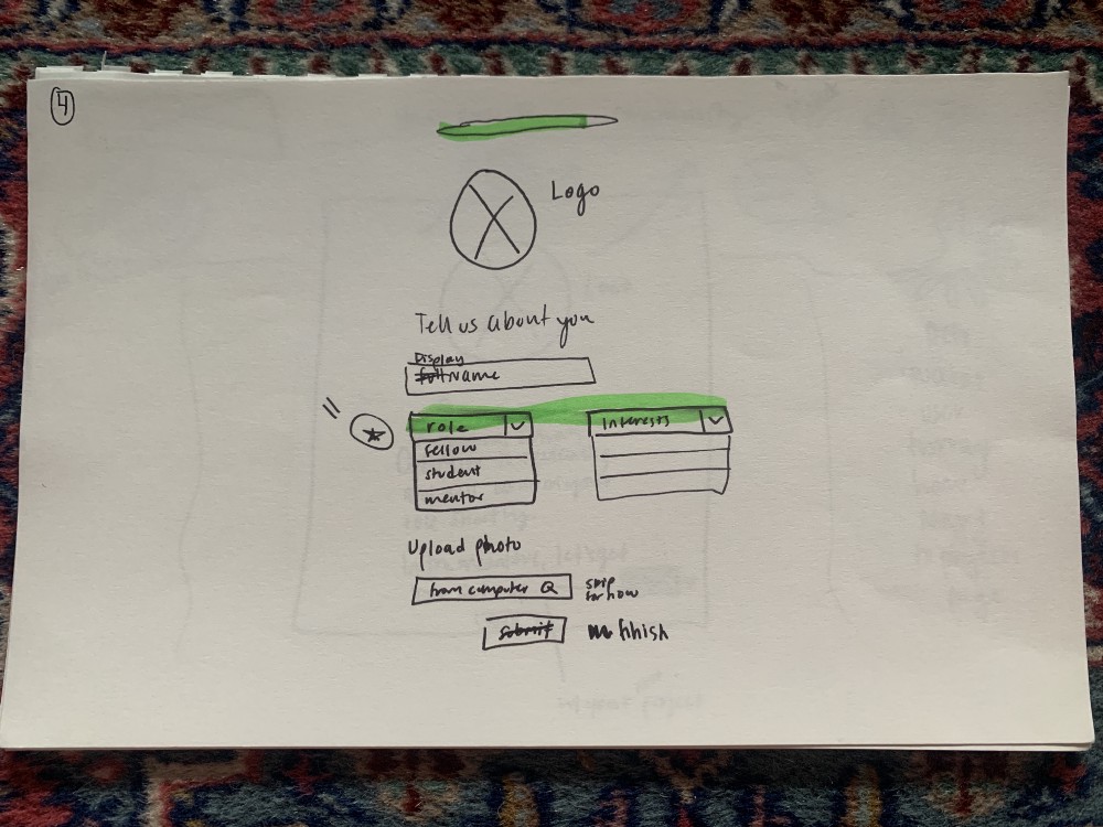
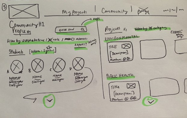
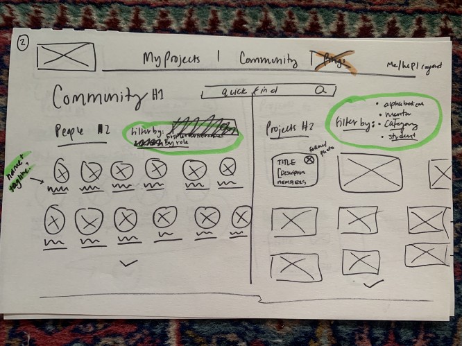
Drawing from our user and wire flows, we created a low-fidelity prototype using pen and paper. These pages included the on-boarding process, the home page, and the community search page, which we used for our first round of usability testing with 5 users.
Round 1: Items Changed
Onboarding: We moved account type (i.e. mentor, alumni, etc.) to the optional fourth onboarding page, “Tell us about you”
Home: We reorganized our information architecture on the home page so elements weren’t as overwhelming by separating projects and community
Community: We made sure that there was enough white space between information cards, and included the filter and search bars within every page so it’s easily accessible
Round 1: Testing Insights
Onboarding: New users were confused about account type on the first onboarding page
Home screen: Users wanted something intuitive but not overwhelming; too many elements on the page that tried to grab attention simultaneously
Community Directory: Users showed preference for information cards that were distinct and clickable. They also liked having the filter and search functionalities
Whiteboarding
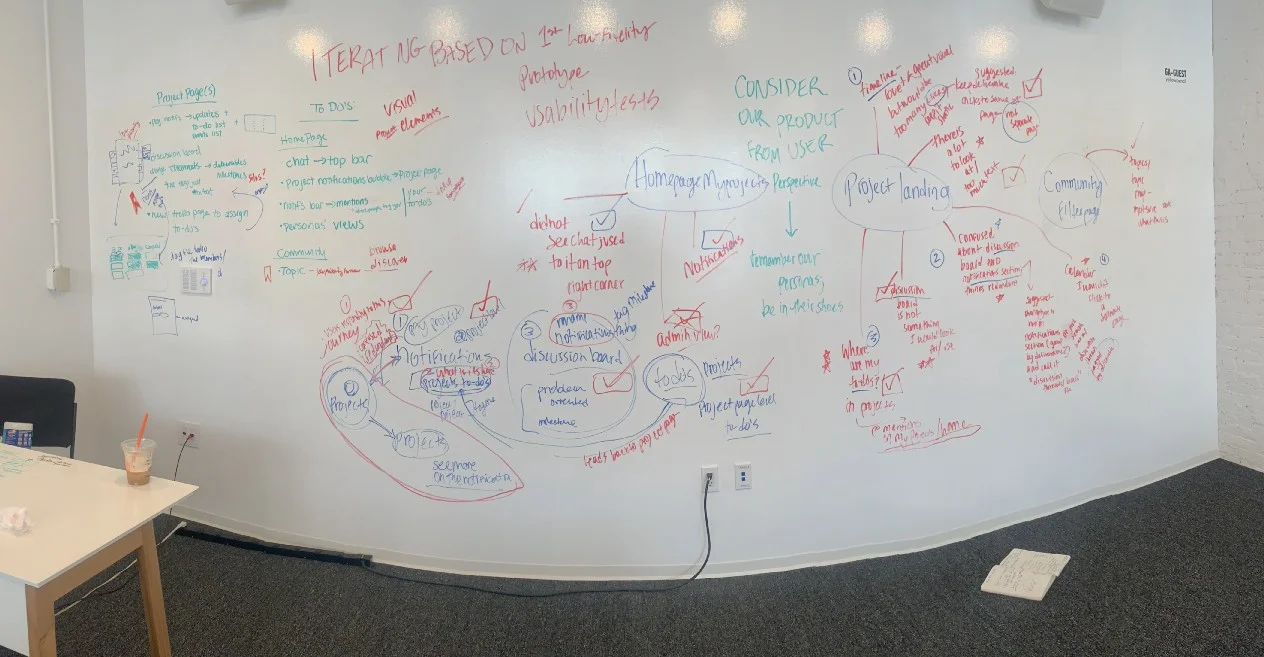
During our usability testing, we noted users’ likes and dislikes, which informed us of the necessary adjustments to information architecture and interaction elements. To organize our usability test findings with our research findings, we taped our paper prototypes to a whiteboard, allowing us a visual understanding of the changes we needed to implement for our low-fidelity clickable prototype.
Mid-Fidelity: Axure Prototype
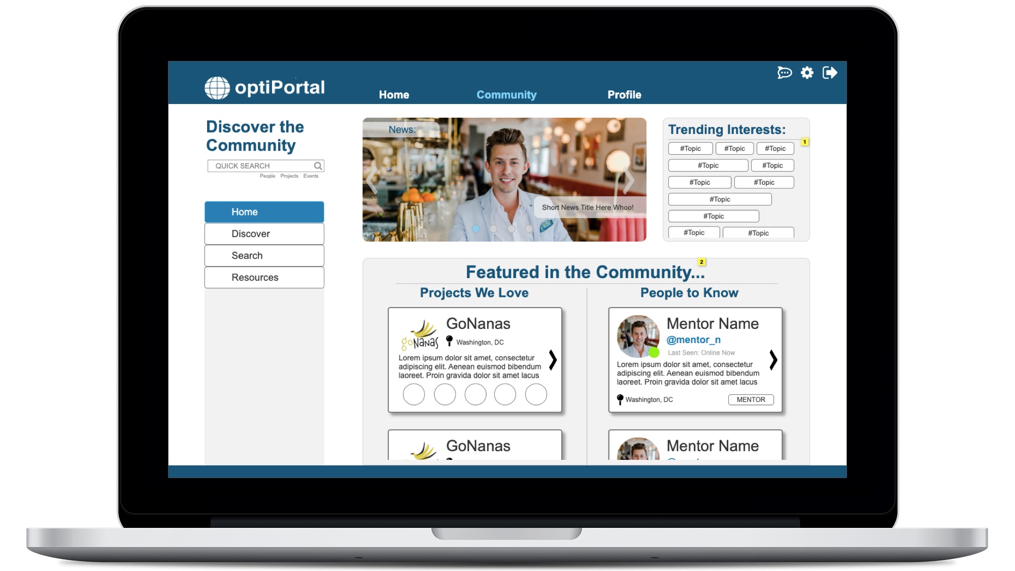
Creating clickable wireframes in Axure was initially a challenge due to learning the software’s ins and outs for the first time during this design sprint. For this iteration, we created foundational flows for the home, project landing, and community filter screens. We focused on building out only these pages to ensure usability before building the entire prototype.
♦️User Interaction Testing
Since every user processes instruction differently, we wanted to ensure that specific tasks could be executed as efficiently as possible. We made certain elements such as the global navigation and secondary navigation clickable, and asked our usability testers to complete tasks such as “Connect with a mentor”. As they attempted to perform the tasks, we observed and documented their reactions and expectations.
Round 2: Test Insights and Changes
Notification types: there were many comments on what notifications signified, specifically “notifications”, “mentions”, and “updates”. We received suggestions on streamlining alert types to match users’ priorities and needs.
Chat feature: users found that the chat feature, currently located at the bottom right, was not visible enough, and that they expected to see it on the upper right corner.
To-do list: users wanted to ability to work immediately upon landing on the home screen, and were confused by the information presented. They sought out their “to-do’s”, expecting it to be more of a workspace rather than a gateway to other pages.
*We simultaneously built out the rest of the wireframes in mid-fidelity and casually tested with users to ensure we were effectively implementing all of the feedback we had received.
Future Iterations
We built this prototype based on the feedback of potential users — to ensure that it truly fits the needs of our target audience, the optiMize community, we would like to test and iterate on our current prototype once more. This achieves two goals: to customize the product for its target user base, and to foster buy-in from the community before optiPortal is launched and implemented.
Furthermore, we prioritized functionality over visual design in order to accomplish our objectives for this project. To become a Minimum Viable Product (MVP), future iterations should consider and incorporate visual design elements.
Finally, as per our user research, we highly suggest optiMize to develop a roll-out and maintenance plan prior to implementation, and to consider a system administrator who would oversee regular training, system updates, and data integrity.
Things I Learned:
♦️Competitive Analysis
Researched core functionalities of competing project management tools to identify absolutely necessary features for successful project management.
♦️Information Architecture
Understanding users’ expectations of content organization to decide on which elements of project management and community directory to include on specific pages.
♦️User Interaction
Ensured that specific tasks could be executed as efficiently as possible by observing usability testers’ reactions and expectations on page content and links.


